

Vector vs Raster in 2026: Which One Should You Use for Modern Design?
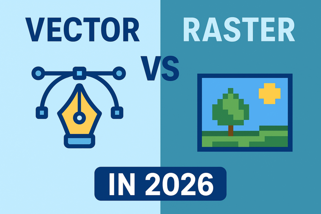
Alt Text: Vector vs Raster 2026 | Source: TypeTasty
Introduction
Choosing between vector and raster graphics has always been part of the design workflow but in 2026, the gap between both formats matters more than ever. With higher-resolution displays, responsive branding, AR-ready assets, and print-on-demand businesses growing rapidly, using the wrong type of file can lead to blurry visuals or heavy pages.
In this guide, you’ll get a clear, human-friendly breakdown of what vector and raster really mean today, when to use each one, and why both still matter in 2026.
What Is Vector?
Vector graphics are built from paths, curves, and shapes, not pixels. This makes them resolution-independent and perfectly scalable.
Common Vector Formats
- SVG
- AI
- EPS
Strengths of Vector Graphics
- Stays sharp at any size
- Lightweight file size
- Great for logos and UI icons
- Easy to edit colors and shapes
- Consistent across web and print
Limitations
- Not ideal for photo-level detail
- Complex textures can break or flatten
- Sometimes limited in special effects
Best Uses in 2026
- Logos and wordmarks
- App & web icons
- Branding systems
- Infographics
- Pattern design
- UI elements
Vector Application sample: Affinity, Adobe Illustrator, Inkscape, CorelDraw. Read more about Affinity here to get to know for newbie into vector Designs.
What Is Raster?
Raster graphics are made of pixels, which means each image has a fixed resolution. When enlarged too much, it loses quality.
Common Raster Formats
- JPG
- PNG
- WEBP
- TIFF
Strengths of Raster Images
- Great for realism and texture
- Perfect for photography
- Works well for marketing graphics
- Supports complex lighting and shading
Limitations
- Cannot scale without pixelation
- Larger file sizes
- Needs multiple sizes for responsive use
Best Uses in 2026
- Product photos
- Lifestyle imagery
- Social media posts
- Banners and thumbnails
- Textured illustrations
- Print mockups
Vector Application sample: Adobe Photoshop, Paint, Krita, Paintool Sai, Clip Studio Paint.
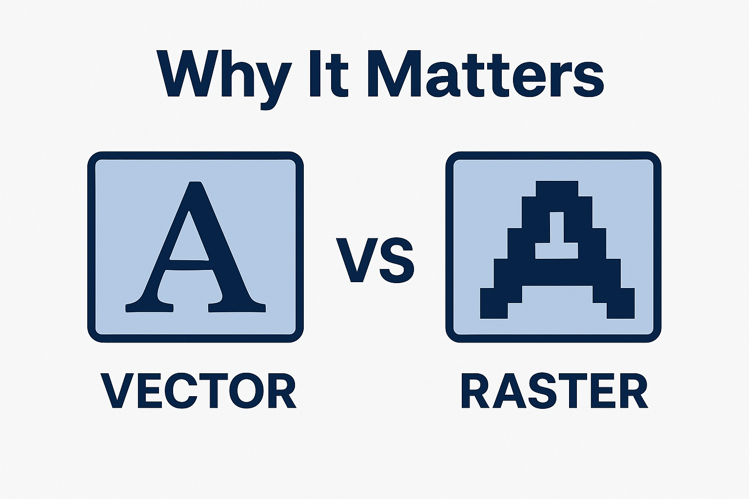
Alt Text: Why Vector & Raster Matters | Source: TypeTasty
Vector vs Raster: 2026 Comparison Table
| Feature | Vector | Raster |
|---|---|---|
| Scalability | Infinite, no pixelation | Limited, can blur when scaled |
| Detail Level | Clean & simple | High detail, realistic textures |
| File Size | Small | Can be large |
| Best For | Logos, UI, branding | Photos, ads, mockups |
| Editability | Very flexible | Resolution-dependent |
| Print Quality | Perfect at all sizes | Requires high DPI |
| Web Use | Great for icons/SVG | Great for images/photos |
Design Trends Shaping Vector & Raster in 2026
1. Brands Move Toward Vector-First Systems
Companies want assets that stay sharp across mobile, desktop, large displays, AR filters, and 3D mockups.
2. Raster Remains King for Marketing
Photo-heavy ads, lifestyle visuals, and textured illustrations will always rely on raster.
3. SVG Growth Across the Web
More websites and apps use SVG thanks to better compatibility and tiny file sizes.
4. AI-Generated Raster Images Explode
AI tools make ultra-realistic raster graphics faster than ever, boosting raster usage in marketing.
5. Hybrid Workflows Become Standard
Designers now combine vector for structure and raster for atmosphere.
Which One Should You Use in 2026?
Use Vector If…
- you need scalability
- you’re designing brand assets
- you want crisp UI graphics
- you aim for lightweight files
Use Raster If…
- you need true realism
- you’re working with photography
- your designs rely on texture
- you create marketing visuals
In 2026, the smartest workflow is hybrid:
Use vector for the base elements and raster for depth and emotion.
Conclusion
Vector and raster aren’t competitors they’re tools with different strengths. As design needs grow more complex in 2026, understanding both formats gives you the flexibility to create sharper brands, more immersive visuals, and more consistent digital experiences.
Knowing when to use each one is what makes your designs stand out.