
Alt text: | Source: Typetasty Designs
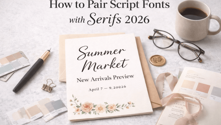
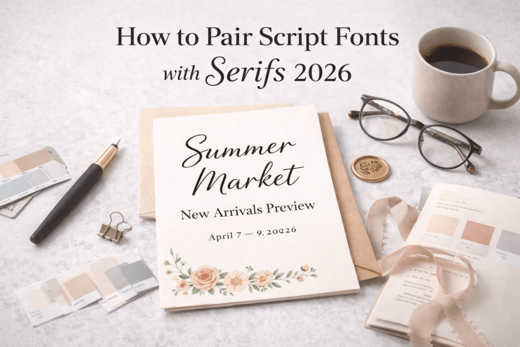
How to Pair Script Fonts with Serifs: The Ultimate 2026 Design Guide
Typography is often described as the "clothes" that your words wear. Just as you wouldn't wear a tuxedo with flip-flops (unless you’re making a very specific fashion statement), you shouldn't pair fonts without a clear understanding of their relationship. Among the most challenging yet rewarding combinations in the design world is the pairing of Script fonts and Serif fonts.
When done correctly, this duo creates a balanced harmony of elegance and authority. When done poorly, it looks like a cluttered mess. In this 1,200-word deep dive, we’ll explore the psychology, the technical rules, and the creative secrets to mastering font pairing for everything from wedding invitations to high-end branding.
1. Understanding the Personalities: Why Script and Serif?
Before we talk about pairing, we need to understand the individual "vibes" of these two families.
The Script Font: The Emotion
Script fonts, like the Loverynote or Spirinotes collections from TypeTasty, represent the human touch. They are fluid, personal, and often carry a high emotional weight. Scripts can be formal (calligraphy) or casual (hand-drawn doodles). Their primary job is to provide visual interest and flair.
The Serif Font: The Authority
Serif fonts are the anchors. With their small "feet" (serifs) at the ends of strokes, they represent tradition, reliability, and legibility. They provide the structure that a design needs to feel professional.
The Rule of Synergy: You pair them because they satisfy different needs. The Script brings the beauty; the Serif brings the clarity.
2. The Golden Rule: Contrast is King
The biggest mistake beginners make is picking two fonts that are too similar. If you use a script that is very "blocky" and pair it with a serif that is also thick and heavy, they will fight for the reader’s attention.
Contrast in Weight
If your script font is thin and wispy (like a fine-line pen), pair it with a medium-weight serif. This creates a clear hierarchy. The eye knows exactly where to look first.
Contrast in Mood
Don't pair a "spooky" or "edgy" script with a "friendly" rounded serif. The moods will clash. If you are using a romantic script, your serif should be elegant and timeless.
3. Establishing Visual Hierarchy
In a 1,200-word guide, we can’t skip the most important technical aspect: Hierarchy. You must decide which font is the "Star" and which is the "Supporting Actor."
Scenario A: The Script is the Star
This is common in wedding invitations or logo marks.
- The Heading: Use a bold, character-rich script (e.g., Rainsoul from TypeTasty).
- The Body: Use a very clean, simple serif. Keep the serif small and give it plenty of "letter spacing" (kerning) to make it look expensive.
Scenario B: The Serif is the Star
Common in editorial design or luxury brochures.
- The Heading: A strong, high-contrast Serif (like a Didot or Bodoni style).
- The Accent: Use a script for small sub-titles or "since 1992" tags. The script here acts as a "signature" rather than the main message.
4. Avoiding the "Collision" of Flourishes
One technical trap in font pairing is the "collision." Script fonts often have "descenders" (the tails of letters like y, g, or j) and "ascenders" (the tops of h or t).
When you place a Serif line of text directly under a Script line, these tails often overlap with the Serif letters. To fix this:
- Increase Leading: Give the lines more vertical space.
- Manual Placement: In tools like Photoshop or Canva, move individual letters if they are touching.
- Size Differentiation: Make the script significantly larger than the serif to create a natural gap.
5. Case Studies with TypeTasty Fonts
Let’s look at how we can apply this using real assets.
The "Rustic Artisan" Look
- Script: Rainsoul (Hand-drawn, organic).
- Serif: A slab serif with rounded edges.
- Why it works: Both have a "natural" feel. It’s perfect for organic food brands or outdoor event stationery.
The "Modern Luxury" Look
- Script: Spirinotes (Tall, thin, elegant).
- Serif: A classic, sharp serif like Garamond.
- Why it works: It feels like a high-fashion magazine. It’s sophisticated and relies on the thin lines of the script to feel "airy."
6. The Role of Color in Pairing
Pairing isn't just about shapes; it's about how color interacts with those shapes.
- Tone-on-Tone: Using a dark brown script with a tan serif creates a vintage, academic look.
- High Contrast: A gold script on a navy background paired with white serif text is the pinnacle of luxury wedding design.
7. Common Pitfalls to Avoid
- Using Two Scripts: Never do this. It’s like having two people shouting at you at the same time.
- Ignoring Legibility: If people can’t read your address because the script is too "fancy," the design has failed.
- Scaling Inconsistently: Don't make the serif so small that it looks like a mistake.
8. Practicing the "Squint Test"
How do you know if your pairing works? Use the Squint Test. Look at your design and squint your eyes until everything becomes a blur.
- Do you see two distinct "blocks" of texture?
- Is one clearly more dominant than the other?
- If it looks like one giant grey blob, you need more contrast.
9. The Future of Typography: 2026 Trends
As we move through 2026, we are seeing a shift toward "Maximalist Minimalism." This means using very simple layouts but with one extremely loud, unique font. Pairing a high-character TypeTasty script with a "invisible" serif is the key to staying on-trend this year.
Conclusion
Mastering the pairing of script and serif fonts is a journey of trial and error. It requires an eye for detail and a heart for emotion. By following the rules of contrast, hierarchy, and mood, you turn a simple layout into a professional brand identity or a memorable piece of stationery.
Ready to experiment? Explore the TypeTasty library today and find your perfect pair.