
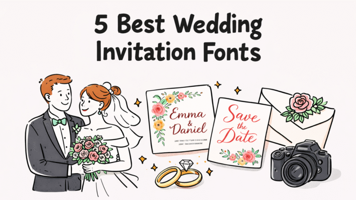
5 Best Wedding Invitation Fonts for a Dreamy Ceremony | TypeTasty
Alt text: 5 Best Wedding Invitation Fonts | Source: TypeTasty Designs
The Art of the First Impression: Why Your Wedding Font Matters
Imagine this: An envelope arrives in your best friend’s mailbox. It’s not a bill, not a flyer, but a textured, cream-colored envelope that feels heavy with importance. As they slide the card out, the first thing that hits them isn't the date or the venue it's the typography.
Before a single word is read, the curves of the letters speak. A sharp, stiff font says "Formal Black-Tie," while a playful, bouncy script whispers "Garden Party & Cocktails." Your wedding invitation is the first chapter of your wedding story. It sets the mood, the dress code, and the emotional tone for the most important day of your life.
In the world of bespoke stationery, finding the best wedding invitation fonts can feel overwhelming. You want something that feels personal, not a "system font" everyone uses for office memos. This is where the curated collection from TypeTasty shines offering character-driven fonts that feel like they were hand-drawn just for you.
The Ultimate Guide to Best Wedding Invitation Fonts: Crafted for a Dreamy Ceremony
Imagine the moment a loved one receives your wedding invitation. It’s more than just a piece of paper; it’s an experience. As they touch the textured cardstock and their eyes meet the graceful letters of your names, they’re not just reading details; they are feeling the promise of your beautiful, dreamy ceremony. This is the profound power of typography in wedding stationery. Your choice of a wedding invitation font is the silent storyteller that sets the stage, hints at the atmosphere, and begins your unique love story even before the first guest arrives. It’s an art form that transforms information into an emotional connection.
Why Your Font Choice is a Cornerstone of Wedding Design
In the intricate world of wedding planning, typography is far from a minor detail. It’s a design cornerstone that plays several crucial roles in ensuring your stationery is as impactful as your day. A carefully chosen font does much more than spell out the details.
1. Evoking the Perfect Emotion
Just as music can define the mood of a film, a font dictates the emotional tone of your wedding. Are you planning a grand, black-tie affair in a historic ballroom? A refined, traditional script might be your muse. Or maybe it’s a whimsical, bohemian celebration in a blooming garden? A light, free-spirited handwritten font would be a perfect match. The right font choice resonates with your guests, preparing them emotionally for the kind of celebration you’ve envisioned.
2. Communicating Style Without Saying a Word
Your invitation is a visual cue. It tells your guests whether to expect a formal dinner, a casual brunch, or a festive beach party. A bold, modern serif font suggests contemporary sophistication, while a playful, bouncing script might imply a relaxed and fun atmosphere. It’s an essential communication tool that aligns your guests' expectations with your unique vision.
Why Typography is the "Secret Sauce" of Wedding Stationery
When we talk about wedding design, we often focus on floral arrangements or color palettes. However, typography is the silent architect of your invitation's layout. A well-chosen font does three critical things:
- Establishes Hierarchy: It guides the eye from the most important information (your names) to the logistical details (the RSVP).
- Reflects Personality: Are you a "Loverynote" couple—sweet and poetic? Or a "Keriwily" duo—fun and unconventional?
- Enhances Legibility: A beautiful font is useless if your Great Aunt Martha can’t read the venue address.
Top Picks: The Best Wedding Invitation Fonts from TypeTasty
Let’s dive into the specific fonts that are currently trending in the wedding industry, all sourced from the unique TypeTasty portfolio.
1. Loverynote: The Epitome of Modern Romance
Loverynote isn't just a font; it's a love letter in digital form. Featuring soft, fluid strokes and a gentle tilt, it mimics the look of high-end calligraphy without the "stiffness" of traditional Copperplate scripts.
- Best For: Minimalist, fine-art weddings.
- Design Tip: Use Loverynote for your names in a large point size, and pair it with a clean sans-serif for the wedding details.
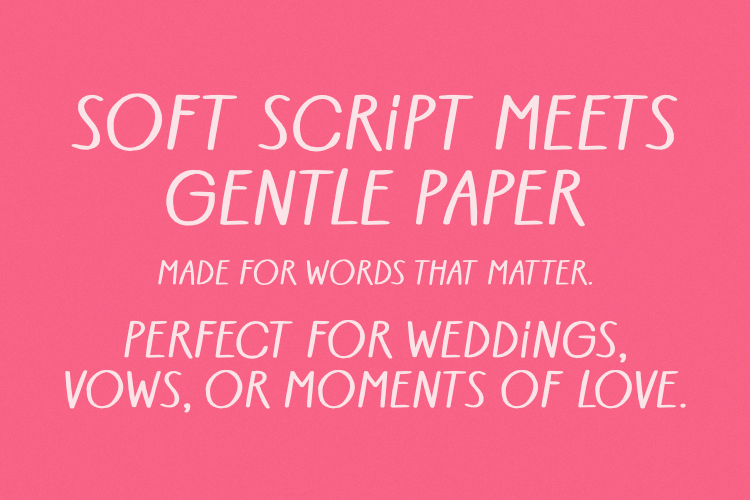
2. Spirinotes: Slim, Sophisticated, and Timeless

For those planning a "Modern Classic" wedding, Spirinotes is the gold standard. It’s a slim, upright script that feels airy and sophisticated. It doesn't crowd the page, making it perfect for invitations with intricate floral borders.
- Best For: Ballroom weddings or black-tie events.
- Pairing: Looks stunning when printed with gold foil or letterpress.
3. Rainsoul: The Authentic Soul of the Woods
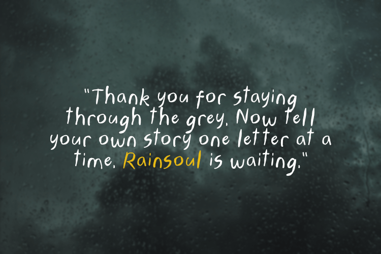
If your dream wedding involves a forest clearing, a rustic barn, or a bohemian beach, Rainsoul is your go-to. It has an "unfinished" handwritten quality that feels incredibly intimate and grounded.
- Best For: Rustic, Boho, or Outdoor ceremonies.
- Styling: Works beautifully on recycled or handmade deckled-edge paper.
4. Keriwily: For the Bold and Playful Couple
Who says weddings have to be serious? Keriwily is quirky, bouncy, and full of life. It’s a "display" font that commands attention. If your wedding is more about the party and the laughs than the pomp and circumstance, this font tells your guests to get ready for a good time.
- Best For: Informal garden parties or "Pop" themed weddings.
5. VeganMatey: Clean, Friendly, and Modern

For the contemporary couple who loves Scandinavian design or mid-century modern aesthetics, VeganMatey offers a friendly, rounded look. It’s exceptionally legible, making it the perfect choice for the "Information Card" or your wedding website.
Design Guide: How to Pair Fonts Like a Pro
Choosing one font is easy; pairing two is where the magic (or the mess) happens. To make your WordPress blog even more helpful, here are three "Design Recipes" using TypeTasty fonts:
| Wedding Theme | The "Star" Font (Names) | The "Support" Font (Details) |
| High Elegance | Spirinotes | Classic Serif (Times/Garamond) |
| Rustic Chic | Rainsoul | Clean Sans-Serif (Montserrat) |
| Modern Minimalist | Loverynote | Light All-Caps Sans-Serif |
Technical Considerations for WordPress Users
When you're building a landing page for your wedding or a blog post showcasing these fonts, keep these technical tips in mind:
- Loading Speed: If you're using custom web fonts, ensure they are optimized so they don't slow down your site.
- Mobile Responsiveness: Script fonts can sometimes become hard to read on small screens. Always test your invitation design on a smartphone.
- Hierarchy with H-Tags: When writing your blog, use H2 for the font names and H3 for the styling tips to keep the SEO bots (and readers) happy.
Mix and Match: Expert Tips for Creating Font Pairings
Choosing your primary font is only the first step. The real magic happens when you pair it with a complementary typeface. A professionally designed invitation almost always uses a combination of fonts to create visual interest and clear hierarchy. Here are three expertly curated pairing "recipes" using TypeTasty fonts as a starting point:
1. High Elegance & Tradition
- The "Star" Font: (e.g., TypeTasty's Spirinotes) A refined, elegant script for names.
- The "Support" Font: A classic serif like Garamond or Times New Roman for all the detail text. This creates a traditional, sophisticated look.
2. Rustic Chic & Intimate
- The "Star" Font: (e.g., TypeTasty's Rainsoul) An organic, handwritten font for names.
- The "Support" Font: A clean, geometric sans-serif font like Montserrat or Lato for details. This maintains a clear, modern feel while allowing the handwritten font to add warmth.
3. Minimalist Modern & Clean
- The "Star" Font: (e.g., TypeTasty's VeganMatey) A friendly, rounded modern font for names, used in a heavier weight.
- The "Support" Font: The same font (VeganMatey) in a lighter weight and perhaps all-caps for details. This creates a beautifully coherent and perfectly balanced minimalist design.
Ensuring Technical Perfection: Tips for WordPress Users
When you are creating a blog post or a dedicated landing page for your wedding on WordPress, there are a few important technical considerations to keep in mind:
1. Prioritize Font Performance
If you choose to use custom web fonts (which are typically loaded via CSS from a font service), be mindful of how they affect your site's loading speed. Large font files can slow down page load times, which is bad for user experience and SEO. Look for font files that are optimized for web use.
2. Check for Mobile Responsiveness
Many guests will view your wedding website or invitations on their phones. Some delicate script or highly stylized display fonts can become difficult to read on smaller screens. Always test your design on a variety of devices to ensure that all information remains perfectly clear and legible.
3. Use Heading Tags Correctly for SEO
When writing your blog post, follow the H-tag structure we’ve used here:
- Use H1 for the main title of your article.
- Use H2 for main sections (like "Top Picks from TypeTasty").
- Use H3 for specific font names within those sections.
- This structure helps both human readers and search engine bots understand your content's hierarchy.
4. Consider Licensing Carefully
Before you finalize any font choices for printing invitations or using on your website, make sure you understand the font's licensing terms. Some fonts may have specific restrictions on their use in commercial or personal projects. Always purchase appropriate licenses to support font designers and avoid any legal issues. TypeTasty provides clear licensing information for all of their fonts.
Your Unique Love, Your Unique Type
Your wedding is a once-in-a-lifetime celebration of your unique love story. From the floral arrangements to the color palette, every detail should be a reflection of you as a couple. By choosing a unique, character-driven typeface from TypeTasty and pairing it with thoughtful design principles, you can transform your wedding invitation into a deeply personal and emotionally resonant work of art.
Final Thoughts: Your Story, Your Type
Your wedding is a once-in-a-lifetime event. Every detail, from the cake flavor to the font on your "Save the Date," should reflect who you are as a couple. By choosing a unique typeface from TypeTasty, you ensure that your invitation doesn't just look like a template—it looks like a piece of art.
Ready to start designing? Head over to TypeTasty to grab your licenses and start creating the invitation of your dreams.