
Alt Text: Luxury Minimalist Branding | Source: TypeTasty
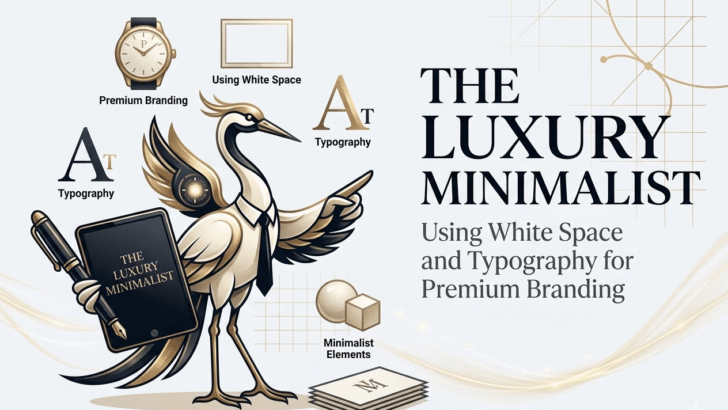
The Luxury Minimalist: How to Use White Space and Typography to Command Premium Prices
In the world of high-end branding, there is a paradox: the more you say, the less you are worth.
In 2026, we are witnessing the death of “loud” marketing. The modern consumer—specifically the high-net-worth individual—is visually overstimulated. They are bombarded by pop-ups, neon gradients, and aggressive call-to-action buttons. To them, Silence is the ultimate luxury.
At TypeTasty, we specialize in the “Quiet Luxury” of design. We believe that true authority doesn’t shout; it whispers with such precision that everyone stops to listen. This is the essence of Luxury Minimalism. It is the strategic use of “nothing” (white space) paired with the “perfect something” (high-character typography).
Here is your 1,500-word blueprint for mastering the luxury minimalist aesthetic and using it to scale your freelance or agency rates.
1. The Psychology of “Expensive” Space
In real estate, a crowded room feels cheap, while a vast, empty gallery feels expensive. Web design is no different. White Space (or Negative Space) is not “wasted” space; it is “active” space. It gives your content room to breathe and, more importantly, it gives the user’s mind room to focus.
The Luxury Prompt: When a brand uses generous margins and wide padding, they are signaling Financial Confidence. Only a brand that is sure of its value can afford to leave 60% of the screen empty. This “spatial breathing room” creates an immediate psychological association with premium products—think Apple, Hermès, or a high-end architectural firm.
2. Typography: The “Jewelry” of Minimalist Design
When you have very few elements on a page, every single element must be flawless. In a minimalist layout, your choice of typeface is not a background detail; it is the protagonist.
This is why Organic Serifs are the backbone of the 2026 luxury movement. A standard sans-serif (like Arial or Inter) often feels “industrial” or “utility-based.” An organic serif, like those in the TypeTasty collection, feels “artisanal.”
Subjective Analysis: Notice the thin hairlines and the slightly irregular terminals of a high-end serif. These details suggest human craftsmanship. In a minimalist environment, these “imperfections” become the texture. The font becomes the jewelry on a simple black dress. Without it, the design is just empty; with it, the design is intentional.
3. The “Broken White” Secret: Softening the Premium Feel
One of the biggest mistakes in “fake” minimalist design is using #FFFFFF (Pure White) and #000000 (Pure Black). In nature, these colors rarely exist in their purest forms.
High-end brands in 2026 are moving toward Broken White (creams, linens, and light greys). Why? Because it feels more “tactile.” Pure white feels like a digital screen; broken white feels like premium stationery. When you pair a “Spirinotes” script or an “Organic Serif” with a warm, off-white background, you instantly lower the user’s heart rate. You move them from a “buying” state to a “curating” state.
4. Hierarchical Restraint: The Power of One
A luxury brand never tries to tell you ten things at once. They tell you one thing, and they tell it perfectly.
In 2026, the trend of Hierarchical Restraint is dominating. This means using a single, massive typographic heading as the hero, with almost no sub-text. This forces the user to engage with the meaning of the words and the beauty of the letterforms.
Marketing Tip: If you want to charge more for your design services, start removing elements from your portfolio. Show that you have the “editorial courage” to let a single word stand alone. Clients pay for your ability to edit, not just your ability to create.
5. Kinetic Elegance: Minimalism in Motion
Minimalism doesn’t have to be static. In fact, in 2026, Kinetic Typography is how we add “soul” to minimalist sites.
Imagine a website where the text only appears as you scroll—not in a flashy “bounce” animation, but in a slow, elegant fade-in that mimics the way your eyes focus on a physical page. This subtle motion keeps the user engaged without breaking the minimalist “Zen.” It is the digital equivalent of a luxury car door closing with a soft, solid “thud” rather than a loud “clang.”
6. The ROI of “Quiet” Branding
Why should a client pay you $10,000 for a logo that is “just a word”?
This is the most common hurdle for freelance designers. The answer lies in Brand Valuation. A complex, cluttered logo is hard to remember and expensive to reproduce. A minimalist, typographic wordmark is iconic. It scales from a favicon to a billboard without losing its soul.
By using TypeTasty fonts, you are providing the client with a “Visual Asset” that works across all mediums. You aren’t just selling a logo; you are selling a system of authority. Minimalist brands are easier to recognize, which leads to higher brand recall, which leads to higher revenue. That is the “Invisible ROI” of luxury design.
7. Developing Your “Subjective Eye”
To be a Luxury Minimalist, you must develop a Subjective Eye. You must be able to explain why a specific curve in a letterform matches the “vibe” of a high-end candle brand or a boutique law firm.
Don’t just say “it looks good.” Say: “The high contrast in this serif mirrors the architectural shadows of your flagship store, creating a sense of permanence and prestige.” When you speak this language, you stop being a “freelancer” and start being a Brand Architect.
8. Case Study: The “TypeTasty” Effect
Let’s look at a hypothetical brand transformation. A local organic skincare line is using a generic, thin sans-serif. They look like a “grocery store” brand.
By applying Luxury Minimalism:
- We increase the white space by 40%.
- We switch the background to a soft “Parchment” tone.
- We replace the logo with a customized TypeTasty Organic Serif.
- We use a single, high-character script for the “Founder’s Note.”
The Result: The perceived value of their $20 cream instantly jumps to $85. Nothing changed about the product, but the Typography and Space changed the story.
9. The Future of Minimalism: 2026 and Beyond
As AI becomes better at generating “complex” graphics, the human ability to create curated simplicity will become even more valuable. AI can do “more” easily, but it struggles with “less.” It struggles with knowing exactly which line to remove to make a design perfect.
Your future as a premium designer depends on your ability to master the “Empty Space.” Embrace the TypeTasty philosophy: Bold choices, organic shapes, and the courage to be quiet.
Conclusion: Less, but Better
The journey to becoming a “Luxury Minimalist” starts with your own brand. Look at your website. Look at your proposals. Are they crowded? Are they noisy?
Start removing the fluff. Choose a signature typeface that speaks for itself. Use white space as a tool, not a void. When you master the art of the “Quiet Luxury,” the high-ticket clients won’t just find you—they will respect you.
The 2026 era of branding is here. It’s time to make some room.