
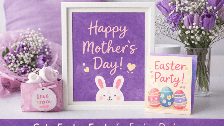
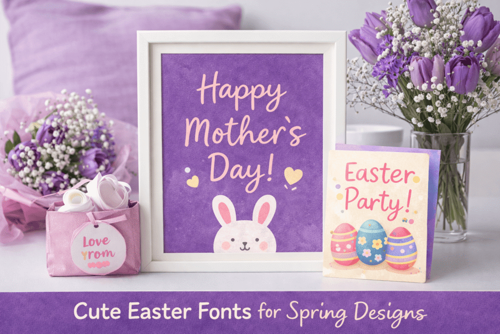
Alt Text: Cute Easter Fonts for Spring Designs | Source: TypeTasty Design
Cute Easter Fonts for Spring Designs
Introduction
When spring arrives, designers start looking for fonts that feel cheerful, light, and playful. Seasonal designs "especially around Easter" often rely on typography that captures the joy of the season.
From greeting cards and social media graphics to printable crafts and product packaging, the right font can instantly make a design feel more festive.
Easter designs are usually associated with soft colors, friendly illustrations, and playful layouts. Because of that, fonts used during spring tend to be more relaxed and approachable compared to formal typography styles.
In this guide, we’ll explore what makes a font perfect for Easter designs and how to choose styles that bring warmth, personality, and creativity to your spring projects.
Why Easter Designs Need Playful Fonts
Seasonal design works best when the typography matches the mood of the celebration.
For Easter-themed visuals, designers usually aim for something that feels:
- cheerful
- soft and friendly
- playful but readable
- warm and welcoming
Playful fonts help communicate the joyful spirit of spring. They pair well with illustrations like bunnies, eggs, flowers, and pastel decorations that are often used in Easter-themed graphics.
Fonts with rounded shapes, smooth curves, or handwritten styles tend to work especially well because they feel more natural and less rigid than traditional typefaces.
Characteristics of Cute Easter Fonts
Not every font works well for seasonal designs. Fonts used in Easter projects usually share a few common characteristics.
1. Rounded Letterforms
Rounded shapes feel softer and more playful. They create a friendly tone that works well for greeting cards and family-oriented designs.
2. Handwritten Style
Handwriting fonts feel personal and warm. They are perfect for quotes, invitations, and decorative text elements.
3. Light and Airy Spacing
Spring designs often feel open and fresh. Fonts that have comfortable spacing between letters help maintain that relaxed atmosphere.
4. Decorative but Readable
Some Easter fonts include small decorative elements such as hearts, curls, or playful swashes. However, readability should always come first especially for titles or messages.
Popular Design Uses for Easter Fonts
Cute fonts are used in many different Easter-themed design projects. Some of the most common applications include:
Greeting Cards
Easter greeting cards are one of the most popular seasonal design products. Cute fonts make messages feel more personal and heartfelt.
Social Media Graphics
Spring promotions, Easter sales, and holiday announcements often use playful fonts to attract attention on platforms like Instagram or Pinterest.
Printable Crafts
Printable activities, coloring pages, and DIY decorations frequently use fun fonts to make designs more engaging for families and children.
Product Packaging
Seasonal packaging for candles, baked goods, or gift items often incorporates spring-inspired typography to create a festive look.
How to Pair Easter Fonts with Other Fonts
Even playful fonts need balance. A good font pairing helps designs look more professional and easier to read.
A common pairing strategy is:
Cute Display Font + Clean Sans-Serif Font
For example:
- use the playful font for headlines
- use a simple font for descriptions or body text
This combination keeps the design visually interesting without overwhelming the reader.
Color Palettes That Work Well with Easter Typography
Typography becomes even more effective when paired with the right color palette.
Spring designs usually feature soft and cheerful colors such as:
- lavender purple
- pastel pink
- light yellow
- mint green
- sky blue
These colors reinforce the seasonal mood and make typography feel lighter and more playful.
Using soft backgrounds with high-contrast text ensures that the font remains readable while still maintaining a festive aesthetic.
Tips for Designing Better Easter Graphics
If you're creating Easter-themed designs, a few simple tips can help your typography stand out.
Keep the Layout Simple
Seasonal illustrations can already be visually busy. Keeping the typography simple helps maintain balance.
Use Plenty of White Space
White space allows decorative fonts to breathe and prevents designs from feeling cluttered.
Focus on Short Messages
Playful fonts work best with short phrases like:
- “Happy Easter”
- “Spring Sale”
- “Easter Blessings”
- “Celebrate Spring”
Long paragraphs should usually be written with a more neutral font.
Why Seasonal Fonts Matter for Designers
Seasonal typography helps brands connect with audiences in a more emotional way.
Designs that reflect holidays and special moments feel more relevant and engaging. For creators, bloggers, and small business owners, using themed fonts can also make seasonal campaigns stand out.
Fonts are often the first visual element people notice in a design. Choosing a style that reflects the spirit of spring can instantly make graphics feel more joyful and memorable.
Conclusion
Easter designs are all about warmth, celebration, and the fresh energy of spring. The right font can bring those feelings to life and make your graphics feel more inviting and festive.
Whether you're creating greeting cards, social media posts, or printable crafts, choosing a playful and readable font can make a big difference in how your designs are perceived.
As spring approaches, experimenting with cute Easter fonts is a great way to add personality and seasonal charm to your creative projects.