

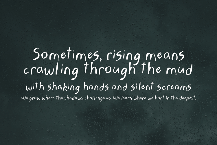
Why Handwriting Fonts Feel Right for the New Year

Alt Text: Minimalist Christmas Design 2026 | Source: TypeTasty Design
Why Handwriting Fonts Feel Right for the New Year
The New Year isn’t loud.
It’s reflective, hopeful, and personal.
While Christmas design is often bold and decorative, New Year visuals tend to slow down. People write goals, plan fresh starts, send thoughtful messages, and create content that feels more human. That’s exactly why handwriting fonts work so well for New Year designs.
In 2026, brands, small businesses, and creators are leaning into handwritten typography to create designs that feel warm, honest, and emotionally grounded. Whether you’re designing greeting cards, planners, social media posts, or branding materials, handwriting fonts help your message feel personal—not corporate.
This article explores why handwriting fonts are perfect for New Year projects, how to choose the right one, and the best ways to use them without ruining readability or design balance.
Why Handwriting Fonts Are Perfect for New Year Design
Handwriting fonts naturally communicate:
- sincerity
- reflection
- intention
- calm optimism
That aligns perfectly with how people feel at the start of a new year.
Handwriting Fonts Work Well Because:
- They feel human, not automated
- They soften clean, minimal layouts
- They add emotion without visual noise
- They stand out in a feed full of bold fonts
In 2026, audiences are tired of over-polished designs. Handwritten type brings things back to a more personal level.
Where Handwriting Fonts Are Commonly Used for New Year Projects
Handwriting fonts are especially popular for:
- New Year greeting cards
- Digital planners & journals
- Instagram & Pinterest posts
- Vision boards
- Quotes & affirmations
- Small business announcements
- Website hero headlines
- Etsy products & printables
If your design involves reflection, intention, or personal growth—handwriting fonts fit naturally.
What Makes a Good Handwriting Font for New Year Designs
Not all handwriting fonts work for New Year themes. In 2026, the best ones share these traits:
1. Calm, Natural Stroke
Avoid shaky or overly playful styles. New Year fonts should feel confident and relaxed.
2. High Readability
Messy handwriting might look artistic, but clarity still matters—especially on screens.
3. Balanced Personality
Not too childish, not too formal. The best fonts sit comfortably in the middle.
4. Clean Letter Connections
Smooth curves and consistent spacing help handwriting fonts feel polished.
Best Handwriting Font Styles for New Year 2026
Instead of listing random font names, let’s break them down by style, so you can choose what fits your brand.
1. Hackynote - Playful Casual Handwriting Fonts

Alt Text: Hackynote Font | Source: TypeTasty
Best for:
- Digital Note
- Greeting cards
- Affirmations
- Planners
- Lifestyle Brands
Why they work:
Hackynote captures the charm of handwritten notes with all their quirks—instantly making your designs more personal, authentic, and fun. Whether you’re a planner lover, creator, teacher, or student, Hackynote makes digital designs feel hand-touched and heartfelt.
Design tip:
Pair with a clean sans-serif font for body text.
2. Loverynote - Soft Romantic Handwriting Fonts

Alt Text: Loverynote Font | Source: TypeTasty
Best for:
- Wedding invitations & RSVP cards
- Social media captions & quotes
- Journals and moodboards
- Personalized gifts & labels
- Brand identity for lifestyle & feminine products
- Social media posts
- Minimal branding
- Small business announcements
These fonts look handwritten but maintain structure. They’re easier to read and work well on mobile screens. Loverynote captures the soft rhythm of affectionate handwriting—perfect for making your messages feel heartfelt and human. Whether you’re writing for love, friendship, or branding, this font adds emotional charm with effortless readability.
3. Rainsoul - Emotional Handwriting Fonts
Alt Text: Rainsoul Font | Source: TypeTasty
Best for:
- Poetic quotes
- Book covers
- Music-related visuals
- Journaling templates
- Emotional branding
- Journals
- Creative Projects
- Personal notes
They feel relaxed and authentic—but should be used sparingly in professional layouts. Rainsoul is a handwritten font that captures the quiet intensity of a rainy day. With natural letter shapes and soft irregularities, it feels like a diary entry written in solitude — perfect for designs that crave honesty and emotion.
4. Spirinotes - Handwriting Fonts

Alt Text: Spirinotes Font | Source: TypeTasty
Best for:
- Bullet journals & daily planners
- Study-related social media content
- Educational YouTube or thumbnails
- Stationery, stickers, and doodle books
- Personal blogs, vlogs, and soft brand voice designs
These fonts feel refined without being formal, ideal for calm New Year aesthetics.
How to Use Handwriting Fonts Without Ruining Your Design
Handwriting fonts are powerful—but only if used correctly.
Best Practices
- Use handwriting fonts for headlines or short phrases
- Limit usage to one handwriting font per design
- Increase line spacing slightly
- Avoid all-caps with handwriting fonts
- Keep background simple
Font Pairing Tip
Handwriting font + neutral sans-serif = perfect balance.
Examples of New Year Copy That Works Well with Handwriting Fonts
Here are phrases that pair beautifully with handwritten typography:
- A fresh start begins here
- New year, gentle intentions
- This year, at your own pace
- Here’s to small progress
- Welcome 2026
Short, emotional phrases work best.
Handwriting Fonts for Small Businesses in 2026
Small businesses benefit greatly from handwriting fonts because they:
- feel approachable
- build trust
- communicate authenticity
Perfect for:
- handmade brands
- home businesses
- digital creators
- mom-owned shops
Used correctly, handwriting fonts help small brands feel personal without looking unprofessional.
Common Mistakes to Avoid
Avoid these when using handwriting fonts:
- Using them for long paragraphs
- Pairing with busy backgrounds
- Combining multiple handwriting fonts
- Ignoring mobile readability
- Overusing decorative swashes
Remember: handwriting fonts are accents, not foundations.
Handwriting Fonts + Minimalist Design = 2026 Trend
One of the strongest design trends in 2026 is combining:
- minimalist layouts
- neutral colors
- plenty of white space
- soft handwriting typography
This combination feels calm, modern, and emotionally rich—perfect for New Year campaigns.
When You Should NOT Use Handwriting Fonts
Handwriting fonts aren’t for every project.
Avoid them for:
- corporate reports
- legal documents
- technical interfaces
- dense information layouts
Choose them when emotion matters more than structure.
Conclusion: Start the New Year with Typography That Feels Human
In 2026, the most effective New Year designs are not the loudest—they’re the most thoughtful. Handwriting fonts help your message feel real, personal, and intentional at a time when people are setting goals and reflecting on what matters.
Used with care, handwritten typography can elevate your New Year designs, strengthen emotional connection, and help your brand stand out in a calm, confident way.
The New Year is personal.
Your typography should be too