

Boosting Campaign Through Data Visualization in Marketing

Alt: A Woman Using Graph as Data Visualization
Data visualization in marketing can transform raw numbers into visuals that highlight patterns and insights. According to Capterra, 92% of marketers say visuals improve decision-making. By turning data into visual representations like charts, dashboards, or infographics, marketers can simplify complex information.
So, if you're wondering what data visualization is in marketing and how it can empower strategies, let’s explore it in detail. We’ll look at the types of visuals you can use, along with practical tips to maximize their impact. Read on to discover how data meets creativity!
Key Takeaways
- Data visualization transforms raw marketing data into clear visuals.
- Visuals help track KPIs, trends, and campaign results.
- Choosing the right visualization depends on audience and purpose.
Benefits of Data Visualization in Marketing
Data visualization offers marketers a powerful way to make sense of complex information. Reveal the data visualization benefits below, especially for the marketing field.
- Identify consumer trends: visuals reveal patterns and behaviors that might otherwise go unnoticed. This helps marketers understand their audience better.
- Measure campaign performance: charts and dashboards allow for accurate tracking of KPIs and enable timely adjustments to strategies.
- Improve team communication: visual reports simplify complex data, so your teams and stakeholders can quickly understand what the results mean.
- Enhance persuasion: well-designed visuals make reports more compelling. This makes it easier to justify your marketing decisions and get support for strategy changes.
Types of Data Visualization in Marketing
Marketers have access to a variety of visualization types, each designed to serve a specific purpose. Here’s the explanation!
1. Charts and Graphs
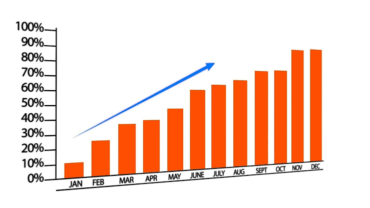
Graphs | Image Source: perkins.org
Charts such as line graphs, bar charts, and pie charts are foundational tools. They are ideal for showing trends over time or comparing campaign results. For example, a bar chart can illustrate monthly sales growth, and a pie chart displays traffic distribution from various channels.
2. Dashboards
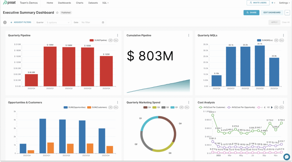
Dashboard | Image Source: preset.io
Dashboards combine multiple visualizations into one interactive interface. This allows marketers to track real-time KPIs, monitor engagement, and measure campaign success in a single view. Consequently, teams can make timely adjustments to strategies based on up-to-date data.
3. Infographics
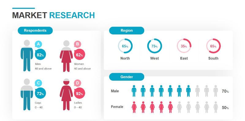
Infographics | Image Source: powerslides.com
Infographics present complex insights in visually appealing formats. They are especially effective for summarizing market research or survey results. Moreover, infographics are shareable on social media and are more appealing for communicating with wider audiences.
How to Choose the Right Data Visualization
Choosing the right type of data visualization in marketing is crucial because using the wrong format can confuse your audience or hide important insights. Below, we've outlined some points to make the best choices.
1. Consider Your Audience
Different stakeholders have different preferences. Executives may respond better to dashboards that show real-time KPIs, while clients or non-technical teams might prefer infographics that summarize insights clearly.
2. Define the Purpose
Determine why you are creating the visualization. Is it to compare metrics, highlight trends, or tell a story? The purpose should guide the choice of charts, dashboards, or infographics.
3. Evaluate Data Complexity
The complexity of your dataset affects which visualization works best. Large, detailed datasets may require interactive dashboards, while smaller or summary data can be effectively presented with charts or infographics.
4. Align with Marketing Objectives
Always ensure the chosen visualization supports your overall strategy and marketing objectives. That's because the right format will highlight key insights and make the data easy to understand, which helps everyone take actionable steps.
5. Ensure Clarity and Simplicity
Avoid clutter and unnecessary details. Use clean layouts, clear labels, and consistent color schemes to make the visualization easy to read and interpret. Simplicity often enhances comprehension and impact.
6. Add Interactivity Where Appropriate
Interactive elements like filters, tooltips, or drill-down options can help users explore data on their own. This is especially useful for dashboards or complex datasets, allowing viewers to focus on the insights most relevant to them.
7. Choose the Right Visualization Format
Not every chart or graphic communicates insights effectively. Bar charts work well for comparisons, line charts highlight trends over time, and heatmaps can reveal patterns in large datasets. So, selecting the right format ensures your data story is both accurate and engaging.
Best Practices for Effective Data Visualization
To get the most from data visualization, marketers should follow several proven strategies. Apply these best practices to ensure your visuals are clear, compelling, and effective!
- Keep it simple. Focus on the most important insights and avoid clutter.
- Use design elements wisely. Add color, labels, and shapes to highlight key points and draw attention to the most relevant information.
- Select the right tools that fit your needs, such as Tableau, Google Data Studio, or Canva, to create professional and accurate visuals.
- Test and iterate. Gather feedback and refine your visuals. Continuous improvement ensures that charts, dashboards, and infographics communicate insights effectively.
Start Visualizing Your Marketing Data for Greater Impact
Data visualization in marketing is essential to turn numbers into charts, dashboards, and infographics. Consequently, marketers can spot trends and measure performance more effectively. It also improves communication and creates persuasive reports. By embracing visuals, campaigns become clearer, smarter, and more impactful.